Friday, August 8, 2008

Nominal Area Choropleth Map

http://www.ilstu.edu/~jrcarter/Geo204/Choro/Tom/

This nominal area choropleth map represents the percentage of hispanics or Latinos in Florida by county. As I 
expected there is a heavier concentration of hispanics in south Florida. I will be interested to see if these 
percentages change with the 2010 Census. I have notices a growing Hispanic population here in Bay County and 
also in Lake County, where I'm from.

Index Value Plot


http://water.usgs.gov/waterwatch/?m=real&r=ga&w=real%2Cplot

This index value plot represents the streamflow for Florida over the last 45 days. This particular index value 

plot represents daily values; there is no limit to the values that could be used. I wanted to compare FL to GA 

mainly due to the drought conditions in Georgia that are affecting the Apalachicola River area.

Trellis Plot

http://www.cs.umd.edu/class/spring2001/cmsc838b/Apps/presentations/Jaime_Spacco/

This graph or plot is the second part of the next post about football...this graph is broken down by team, using only wins, running offense, and running defense. I thought this was a fun graph, one that may be helpful to fantasy football fanatics.

Parallel Coordinate Graph

http://www.cs.umd.edu/class/spring2001/cmsc838b/Apps/presentations/Jaime_Spacco/

A parallel coordinates graph connects a series of values and shows relationships between different variables. The graph I used happens to show the correlation between wins and offense and defense in the National Football League. This particular set of data is from the 2000 NFL season. The second graph is broken down by team, using only wins, running offense, and running defense. I thought this was a fun graph, one that may be helpful to fantasy football fanatics

Box Plot

http://www.itl.nist.gov/div898/handbook/eda/section3/boxplot.htm

The box plot identifies the middle 50% of the data, the median, and the extreme points. Box plots are formed by

Vertical axis: Response variable
Horizontal axis: The factor of interest

More specifically, we

  1. Calculate the median and the quartiles (the lower quartile is the 25th percentile and the upper quartile 
    is the75th percentile).

  2. Plot a symbol at the median (or draw a line) and draw a box (hence the name--box plot) between the
    lower and upper quartiles; this box represents the middle 50% of the data--the "body" of the data.
  3. Draw a line from the lower quartile to the minimum point and another line from the upper quartile to  
    the maximum point. Typically a symbol is drawn at these minimum and maximum points, although 
    this is optional.

Similarity Matrix

http://www.clcbio.com/scienceimages/sm/smith-waterman-optimal-local-alignment.png

A similarity matrix is used in determining the similarity between two sets of data. This matrix is compiled by using the Smith-Waterman algorithm. This algorithm finds determines the similarity between protein sequences.

Stem and Leaf

http://www.highpointsmath.com/sitemap/Stem-and-LeafPlot.html

 Stem and leaf plots are useful for arranging data. One could be used for diagramming ages. You would quickly be able to tell which age group is represented the most. 

Histogram

http://www.socialresearchmethods.net/kb/statcorr.php

A histogram is a graphical representation of a data set. A histogram is probably one of the earliest graphs a elementary student learns how to read/make. Of course as a child we called them bar graphs...nothing as fancy as a histogram. 

This histogram is a list of heights and the frequency in which they occur. This is something very similar to what I did in school, however this one was a part of a correlation study in which height was correlated to self-esteem.


Correlation Matrix

http://www.livestockgenomics.csiro.au/Genome_to_Phenome/matrix32_blocked.png

This is a correlation matrix for a subset of the top 100 cancer genes. Thick lines indicate blocks: A for extracellular matrix; B for nucleus and cell progression; C for actin cytoskeleton; D for fatty acid metabolism and E for glutamine/glutathioine/oxidative. Stress. This is a study done in Australia and uses multiple sources for its data including the entire Australian National Cancer database.
A correlation matrix is the visual representation of the correlation between two variables. 

Thursday, August 7, 2008

Bilateral Graph


A bilateral graph displays data on two ranges. One set of data is increasing on one side of zero while the other is decreasing. This data is information pertaining to the proposed increase in British aviation. This group wants to stop the expansion of airports and aviation in general in order to cut emissions in England.

Climagraph

I found this website interesting...it teaches how to read a climagraph. Below is a climagraph I found. The website is:  http://www.cotf.edu/ete/modules/msese/earthsysflr/climograph.html

I have included the instructions that were on the website.


1. The type of biome associated with the place.

2. The place where the temperature and precipitation were measured.

3. A scale used to indicate inches of precipitation.

4. The months of the year. The letters J, F, M, etc., stand for January, February, March, etc.

5. The temperature scale in degrees Fahrenheit. 

6. A bar graph showing the average precipitation for each month. In this example, the average total precipitation is about 1 inch in January and nearly 4 inches in August. (Note: Values for this graph are found on the left-hand scale.)

7. A line graph showing monthly temperature during the year. In this example, the lowest temperature is about -5°F in January and the highest is about 45°F in July. (Note: Values for this graph are found on the right-hand scale.)

Lorenz Curve


A Lorenz Curve is used to represent income distribution. I chose the map above because of the way it explained how to read the map.  The greater the curve, the greater the inequality. 


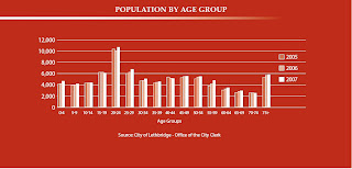
Population Profile


This population profile is broke down by age. It is a population profile for Lethbridge, a city in Alberta Canada. There is no limit to the number variables or ways to present those variables in a population profile.

Wednesday, August 6, 2008

Triangle Plot


http://ex-parrot.com/~chris/wwwitter/20050407-it_doesnt_matter_how_you_vote_either_way_your_planet_is_doomed.html

This is a triangle plot representing the UK election estimated outcome. A triangle plot uses three variable and the uses
interior of the triangle to graph the data. A gardening book I recently bought contained a triangle graph for soil composition.

Wind Rose

http://www.pscleanair.org/airq/windrose/default.aspx

This windrose represents the amount of time and direction 

in which wind blew at Indian Hill in Tacoma, WA

The colors, length, and width of the brackets

represent wind speed, air pollutants and temperature.

Univariate Choropleth Map


This univariate is also an example of satellite photography. This map attempts to show the concentrated urban population in the United States. This image was captured at night and the bright areas represent lights that are on. This is not a very reliable data source because there are so many variables. 

Bivariate Choropleth Map

http://www.spokane.wsu.edu/gis/Classes/davis/uc1.jpg


A bi-variate choropleth map only contains two variables. In this particular example the two variables are residential and business land use patterns.

Unclassed Choropleth Map

http://www.spokane.wsu.edu/gis/Classes/images/T3/t3_choro2.jpg

This is an example of an unclassed choropleth map. The data is not
areally averaged and there are no clear cut data profiles. This map only
uses a few colors to differentiate the population in Eastern Washington.

Classed Choropleth Map


oldbushie.blogspot.com/ 2007/10/map-of-week.html

This classed choropleth map uses average rainfall in Washington state as its classes. A choropleth map shows regions or areas that share common characteristics. Western Washington is a beautiful state although there is a lot of rain. We really enjoyed our time there and can't wait to visit again.

Sunday, August 3, 2008

Star Plot


                      http://www.itl.nist.gov/div898/handbook/eda/section3/starplot.htm

       This star plot map is based on 16 cars. Each of the radii represents a different variable of the car. The variables range from cost to mileage to size and interior space. The connecting line of the circle crosses the radii according to its rank, the further out, the greater the rank. 

Continuously Variable Proportional Circle Map
 http://gsc.nrcan.gc.ca/mindep/metallogeny/sedex/selwyn/index_e.php


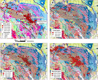
This is an example of a Continuously Variable Proportional Circle Map. This map

represents the distribution of minerals in sediment of streams that drain the Selwyn 

Basin, Yukon, Canada. The variables in this map are the amounts and location of minerals in the streams.


Proportional Circle Map


pubs.usgs.gov/ fs/fs-004-03/
In this Proportional Circle map the area of the circle is proportional to the channel width. The color of the large circle approximates the color of the water (gray indicates no color was mentioned in the journals). Descriptions of the bed material are determined by the position of the solid black circle within the black triangle. The example in the upper right indicates a width of 500 yards, a yellow water color, and bed material that is mostly sand with some gravel and some mud. This data is taken from journals and information from the Lewis and Clark expeditions.

DEM


http://www.digitalmapdata.com/images/dem_NasaSrtm_Tasmania_Ex.jpg

This DEM (Digital Elevation Model) compares DEM images of Tasmania as taken from two different sources. The image on the left is from the SRTM or Shuttle Radar Topography Mission. The images on the right are from a GADDS 9 Second DEM. The difference in the detail is amazing.                                                                                                                                                       


DOQQ

www.soest.hawaii.edu/.../ data/hawaii/index.html

While smaller than I wanted this is a DOQQ (Digital Orthophoto Quarter Quadrangle) of the island of Kauai, Hawaii. A DOQQ, as the name suggests is a digital aerial photo using film that captures infrared light. This particular image is the northern coastline, also known as the Na Pali Coastline. This area is majestic. Because of the rugged terrain this area (and the interior) is not traversable by car. Therefore, to get from one side of the island to the other, you would have to drive all the way around. 

DLG


oregonexplorer.info/ craterlake/dlg.html

This DLG (digital line graph) is using the same 7.5 minute quadrangle as the DRG I posted of East Crater Lake. A DLG is digital vector data representing cartographic data. 

DRG


oregonexplorer.info/ craterlake/dlgv32.html
This DRG (Digital Raster Graphic) is of east Crater Lake in Oregon. The lake is what formed
after a volcanic eruption some 7,700 years ago. This DRG is a digitally scanned image of a paper USGS topographic map. DRG's are often used for GIS applications.

Isopleth


dwb.unl.edu/.../library/ weekly/aa071600a.htm

An isopleth map is simply a map that shows connecting areas of equal value. This particular map shows the concentration of Hydrogen ions taken from various field laboratories. The purpose of the study was to determine areas where acid rain is present. An isopleth map can also be represented by lines similar to those in isohyets and isotachs.

Isohyet


www.comet.ucar.edu/.../ c11_28jul97/lab1.htm

This isohyet map shows rainfall over Colorado during a storm. The rings link areas of equal rainfall. The central area received 9 inches of rain and the amounts receded towards the outside.

Isotachs


http://www.nlmoc.navy.mil/mdl/aor/ngpstriso200/012hr_ngps_200mbstreamisotachs.gif

This image contains both isobars and isotachs. The isotachs are the dotted lines and they connect surface areas of equal wind speed.


Isobars


www.silweather.com/ mapindx.html

An isobar is a line drawn on a weather map connecting areas of equal pressure. This particular map has the isobars overlaying satellite imagery. This particular map was done by NOAA, the National Oceanic and Atmospheric Administration. NOAA not only provides atmospheric information they also do such things as tracking the migration of whales. I'm sure this is not the extent of their duties, but I thought it was interesting.

LIDAR


jerz.setonhill.edu/ design/WTC/index.html

LIDAR (light detection and ranging) is used to 
map topographical data. I chose this LIDAR image of the ground zero, the World Trade Center disaster area because of it familiarity with most people. The image on the left is the before shot. You can see the small(er) building with the dome at the top in front of the towers. In the 'after' shot the domed building is on the left. The towers are completely gone. LIDAR imaging leaves a haunting picture of the area
that remained.

Saturday, August 2, 2008

Doppler Radar Image

www.srh.noaa.gov/tlh/ wxevents/alberto061306.html

Sticking with my hurricane theme, this is a doppler image of Hurricane Alberto. Most of the weather reports we get from our local news shows doppler radar images. The resolution of doppler radar images has improved over the years so that our local meteorologist can look for signs of tornadic activity.

B&W Aerial Photo


www.ww2incolor.com/. ../dday_aerial

This B&W Aerial photo was taken on D-Day towards the end of World War II. This is the day
that was portrayed at the beginning of the movie Saving Private Ryan. I'm not sure what 
beach this is a photo of, but no matter which, this was the beginning of the end for Germany. Knowing what happened next, I wonder what these young men were thinking wading through the waves.

Infrared Aerial Photo

This photo is Grover Island off of the Georgia Coast. This island has a really interesting
history and is reported to be the first protected forest in the United States. The island is
a pristine example of a natural maritime forest.

Cartographic Animation

http://commons.wikimedia.org/wiki/Image:Hurricane_Elena_NOAA.gif

This is an example of cartographic animation (although I can't get it to animate). I figured I would stick with the 
Hurricane Elena theme. We have all seen what a moving hurricane looks like on the weather channel. 
I find hurricanes interesting because their path cannot be truly forecasted, sometimes, as with Elena, 
they veer off the expected fairly quickly.

Statistical Map


www.floridahurricane.net/

I found this map, which is about a topic near and dear to most Floridians hearts: Hurricanes. This website had so much information on hurricanes and hurricane preparedness that I bookmarked it. Although chances of a hurricane coming to Panama City are low, it only takes one major storm to change your life.  I was in Tampa for Hurricane Elena (1985) and remember evacuating...statistically Tampa is not a bad place to be, but its not out of range of a hurricane either.

Cartogram


This cartogram is a representation of the World Cup Soccer competition. It started out with each country that qualified being represented in equal size. As the competition progressed each team that won was doubled in size to represent their dominance. The final cartogram shows the World Cup champion, Italy. The other countries that did not participate are shown using their actual area.

Flow Map


www.vtvt.ece.vt.edu/ vlsidesign/designFlow.php

This an example of a flow map. A flow map can be represented in different ways. This particular one is a sample of a design process. 

Saturday, July 26, 2008

Isoline Map


www.scar.org/publications/ reports/20/Rep20a.html

This isoline map represents the arctic geoid. An isoline map has a series of circles that join areas of the same value whether it is altitude, temperature, air pressure, etc. 

Sunday, July 20, 2008

Choropleth Map

http://www.directionsmag.com/images/newsletter/2007/01_18/HIV_Map_lg.jpg

This choropleth map shows the number of people living with HIV in Europe.
I noticed that Russia has the largest concentration which I expected, but I did not 
expect Portugal and Spain to have the next highest concentration. Hopefully one
day there will be a cure and this horrible disease can be eradicated.

Hypsometric Map

Once again a map of Washington state. This is one of my favorite places. We really enjoyed our time there and this map represents why. We lived in Tacoma on the western side of the state where it is green.This area gets a lot of rain and is very green. The brown area are the mountains. In the early spring you could wear shorts and then drive to the mountains where it is snowy. On the eastern side of the state it is more desert-like. The Army uses the large gold colored area in the middle to simulate desert conditions. 
 
http://www.co.kittitas.wa.us/images/maps/map_wa_relief.jpg

Dot Distribution Map


This dot distribution map represents the population of Ohio townships according to the 2000 U.S. Census. I chose this map because it is not only a dot distribution map, it is broken up by townships. I have family in south central Ohio. I think this map shows that Ohio's population is spread somewhat evenly throughout the state with some definitively defined urban areas mostly along the borders.
http://exurban.osu.edu/Maps2/tshippop1.jpg 

Propaganda Map...

This is a propaganda map of obesity in the United States. Notice how the cups form the image of McDonalds. The idea behind the map was to challenge businesses, designers, and builders to take on the obesity problem in the U.S.


http://www.aiany.org/eOCULUS/2005/images/0513/valuemeal_nation.jpg

Thursday, June 26, 2008

Earthquake KML

This map from Google Earth is using a KML for recent earthquake activity. I found this particular KML file interesting because I didn't realize how many earthquakes occur on a daily basis. The map was very easy to use and navigate; it seemed to be an enhancement to Google Earth. I found other sites and KML files and even did a search for KML files with a certain keyword. I had a lot of fun with this exercise and will use this application of KML files again.

Sunday, May 25, 2008

PLSS Map


This is a PLSS (Public Land Survey System) map of Colorado Springs, CO. Beside is a zoomed-in section with lable. The PLSS map is based on a meridian, and then 6 mile squares are sectioned off, creating 36 sq mile townships. The townships are further divided into smaller sections. A couple of friends of mine recently moved to Colorado Springs and they are finding the township thing interesting.