Saturday, August 2, 2008

Cartogram


This cartogram is a representation of the World Cup Soccer competition. It started out with each country that qualified being represented in equal size. As the competition progressed each team that won was doubled in size to represent their dominance. The final cartogram shows the World Cup champion, Italy. The other countries that did not participate are shown using their actual area.

Flow Map


www.vtvt.ece.vt.edu/ vlsidesign/designFlow.php

This an example of a flow map. A flow map can be represented in different ways. This particular one is a sample of a design process. 

Saturday, July 26, 2008

Isoline Map


www.scar.org/publications/ reports/20/Rep20a.html

This isoline map represents the arctic geoid. An isoline map has a series of circles that join areas of the same value whether it is altitude, temperature, air pressure, etc. 

Sunday, July 20, 2008

Choropleth Map

http://www.directionsmag.com/images/newsletter/2007/01_18/HIV_Map_lg.jpg

This choropleth map shows the number of people living with HIV in Europe.
I noticed that Russia has the largest concentration which I expected, but I did not 
expect Portugal and Spain to have the next highest concentration. Hopefully one
day there will be a cure and this horrible disease can be eradicated.

Hypsometric Map

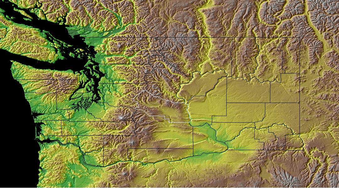
Once again a map of Washington state. This is one of my favorite places. We really enjoyed our time there and this map represents why. We lived in Tacoma on the western side of the state where it is green.This area gets a lot of rain and is very green. The brown area are the mountains. In the early spring you could wear shorts and then drive to the mountains where it is snowy. On the eastern side of the state it is more desert-like. The Army uses the large gold colored area in the middle to simulate desert conditions. 
 
http://www.co.kittitas.wa.us/images/maps/map_wa_relief.jpg

Dot Distribution Map


This dot distribution map represents the population of Ohio townships according to the 2000 U.S. Census. I chose this map because it is not only a dot distribution map, it is broken up by townships. I have family in south central Ohio. I think this map shows that Ohio's population is spread somewhat evenly throughout the state with some definitively defined urban areas mostly along the borders.
http://exurban.osu.edu/Maps2/tshippop1.jpg 

Propaganda Map...

This is a propaganda map of obesity in the United States. Notice how the cups form the image of McDonalds. The idea behind the map was to challenge businesses, designers, and builders to take on the obesity problem in the U.S.


http://www.aiany.org/eOCULUS/2005/images/0513/valuemeal_nation.jpg